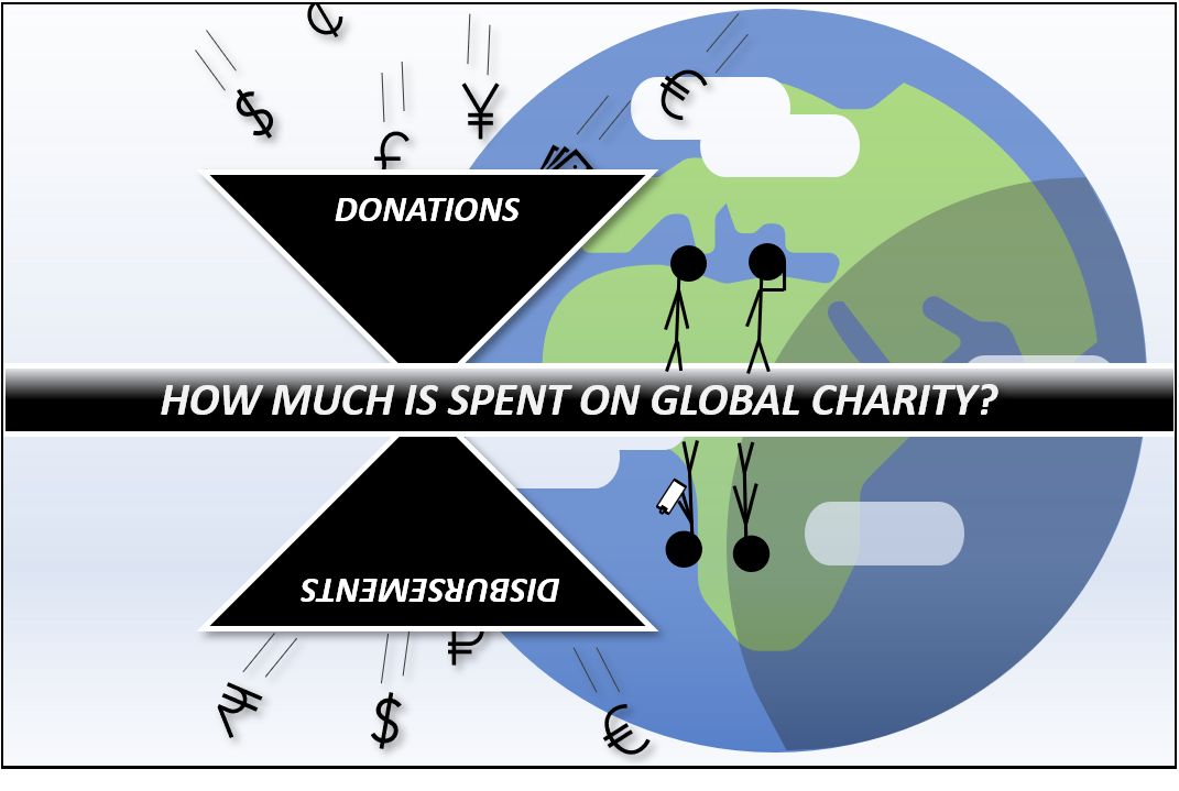
In my world, wrapping your head around a topic starts with tracing the boundaries of the big picture. In the case of global charity, that means finding out how much is spent on it every year, what that number looks like in comparison to other things, and what the sum consists of. Having done this, it’s easier to stay oriented during deep-dives into details.
- For background on what this series is all about, see the Series Introduction.
- For details on definitions and why I consider some things charity and other things not, see What should be considered charity?
First of all, why exactly should we care about the size of the charity “market”? Well, it’s interesting to know, for one thing. We might be looking forward to confirming our preconceptions, or to be surprised. Before I started writing this series, I had a kind of a sweet expectation that my research would land at some ridiculously tiny number that would tickle my cynical itch: “I knew it! All that big talk about helping and donating money and actually we’re doing jack shit in the larger scheme of things”. For one thing, we should care about the actual size of charity to eradicate such cynicism, because it turns out to be quite wrong.
A second thing is to be able to turn all the lights on in the room. Normally, in the room with all of global charity in it, we operate with a tiny flashlight that allows us to see only what we directly point at – the charities we know are active in our home town or country, for example, and perhaps a random article about foreign aid in the news now and then. But as we move the flashlight beam from one focus to the next, we let darkness swallow what the beam leaves behind. In other words, we lose sight of how one thing connects to the next, and how all things connect to the whole. And if we lack that connection, we also lack the ability to judge what’s big and what’s small.
Try it out: if you see, for example, the government of Hungary promoting a program called Hungary Helps that has distributed 8 billion forints (roughly US $25 million) to persecuted Christians in the Middle East and Africa over 2 years, would you say that’s a lot? Should you be delighted and impressed? Well, if all you have is a flashlight, that’s as much information as you’ll get. The answer will depend on your personal experience of how significant $25 million is. If, instead, you turn all the lights on, you can see that Hungary Helps comprises probably about 5-8% of the total Official Development Assistance Hungary sends abroad annually, and that if Hungary was as generous as the average ODA-donating country in 2018, it would have sent more than twice as much than it did. (The average country donated ODA equivalent to 0.31% of their gross national income – Hungary donated 0.14%.)

Data sources: Compare your country, OECD, AboutHungary.hu
Notwithstanding the actual impact Hungary Helps is having (which might be huge, but who knows, the program reports extremely limited data on their budget, activities and what they achieve), you can now probably conclude that given the full context, the size of Hungary Helps is not particularly impressive. This – turning the lights on and seeing the bigger picture – is a fundamental skill to possess whatever charity concept or program we investigate.
Thirdly, a further benefit arising from the lights being on is to see all the way to the edges and limits of the room. To see what there is in the room, and what there is not. To understand the full range of your options and their relative scales and impact potentials.
Say, for example, that you get worried about the U.S. freezing or decreasing spending on foreign aid. Is that worry justified? Will millions of people suddenly be left without assistance they have relied on? Well, surely, if the U.S. simply makes cuts to their ODA budget, then someone, somewhere will be left without resources they were going to receive, or at least they will have to find those resources elsewhere. But having the lights on in the room, we see this is not all there is to charitable resources flowing from the U.S.. In fact, while American ODA has remained quite flat since the 2008-09 recession, both outward remittances and private donations to international causes from the U.S. have been rising more or less significantly. So even if the government decided to cut foreign aid, those cuts are offset by American citizens and foundations incrementally giving more, as well as migrant workers finding more opportunities to help their communities by working in the U.S. and sending money back home.

Note for data nerds: For remittances, I’m here using the IMF bill-of-payments based dataset from the World Bank (i.e. what remittance-sending countries self-report). Later in the series I will mainly use the Bilateral Remittance Matrix dataset, which is based on the methodology by Ratha and Shar (2007) and generally gives much higher figures compared to the IMF BoP-based dataset. The IMF BoP dataset is more consistent over time but most likely misses large amounts of remittances due to reporting standards. The Remittance Matrix dataset is only available for a handful of years, but on the other hand comes closer to capturing the full scope of remittances sent by the world’s countries. For more details, visit KNOMAD.
Data sources: Giving USA, World Bank, OECD
Based on these data, you can actually conclude that from a trends point of view, total charity from the U.S. has been pointing upward and that it will take a lot to reverse the trend through cuts in ODA. This, again, has only limited things to say about what all this money goes on to actually do and what its impact is, but identifying the edges and the contents of the room does let us see more options we can act on and stay hopeful for.
That’s why we should care about the total size of global charity, to name a few reasons. Knowing its size is but the beginning to understanding it deeply, though. That is why this post is categorized as Fundamentals of Global Charity. As we move deeper into the data, keep in mind that every step of the way there’s a world of nuance hidden in every number, and that at this very high level of analysis we will be cutting many corners short. Not due to laziness, but due to limitations in the state and availability of data. I am convinced, however, that accepting and keeping track of those limitations will enable us to shift our mental position leaps and bounds towards the true state and form of global charity – light-years, probably, from that dark place where we stand with nothing but a flashlight in our hands.
Now, to business. In a single number, according to my analysis, the world spent about US $1.479 trillion on charity in 2018. And that’s trillions with a T – in single dollars it would look like this: $1,479,000,000,000. Seems a lot. Is it? On a global scale, how much is it compared to other things we spend money on, for example?
Glad you asked. To give a few reference points, this ~$1.5 trillion of charity amounts to:
- About 2.5x the 2018 defense budget of the U.S., the largest defense budget in the world.
- About 1.5x the total market capitalization of Apple, one of the most valuable companies in the world (in July 2019).
- And if charity was a country, its GDP would make it the world’s 13th largest economy, behind Russia and ahead of Spain.
To make it easier to wrap your head around these figures, I made this helpful chart below including a few more things to compare to (click for a larger image):

Data sources: The Money Project, DoD.defense.gov, Statista, TheBalance.com, Yahoo Finance, StatisticsTimes.com, author analysis
We can also compare the figure of $1.5 trillion against the GDP of the whole world put together, i.e. the “gross world product”. In 2018, the gross world product amounted to about $85 trillion dollars. This would imply that for every 100 dollars spent on anything in the world, about 1.7 dollars was spent on charitable causes. That’s roughly the same amount as gets spent on alcohol each year and significantly more than is spent on airline travel. So yes, it indeed is a lot, all things considered.
Next, let’s break things down. Below you’ll see a very important chart about the main sources from which this figure of ~$1.5 trillion is built from:

Data sources: Author analysis, based on data from World Bank, OECD, GIIN, Giving USA and dozens of other sources for data on private donations
The four rectangles combined represent total spending on global charity in 2018. Each individual rectangle represents one of the four main sources of charity I laid out in the post What should be considered charity?
When I first looked at these figures, I was surprised. I thought Official Development Assistance would form the largest rectangle, because that’s the money governments donate, and governments are huge compared to puny individual people, right? No, it turns out. Half of the whole charitable landscape is formed by private donations from individuals, foundations and corporations (of which individuals give by far the most, as we’ll see later on). Equally surprising was to see how much money flows from better-off countries to worse-off countries in the form of personal remittances. More than three times as much as ODA! For-profit charity, on the other hand, occupied roughly the kind of fringe corner I was expecting it to, comprising about 5% of total global charity.
The surprise of seeing these figures and their relations is not a huge surprise. Having spent hundreds of hours on research over the past two years, I could not find a source that would have gone through the trouble of bringing data like this together. But that’s kind of fair, I guess. Given that there is no commonly accepted definition of what exactly counts as charity, there’s likely very little demand for data and analysis in this specific form. It’s very unlike, for example, global market shares of mobile phone manufacturers. That’s a metric extremely well defined and accepted, and detailed analysis related to it can easily fetch thousands of dollars per report, because there are a lot of firms who want to understand and use that data in that form. That’s why, conversely, it’s not hard to find such data. In the case of global charity, I’m sure there are loads of people who subscribe to a different definition than I do, and they concentrate on working with some subset of the data I present here, or with something completely else. Some, certainly, would rather exclude remittances and/or for-profit charity from the big picture. If so, be my guest – I intend to present my findings in a format that makes it relatively easy to do those calculations, if you wish to.
For me, what this specific analysis says is that the global landscape of charity is mainly comprised of the generosity of individuals in the form of private donations and remittances, while contributions to a lesser extent come from governments, multinational organizations, foundations, companies and impact investors. It says that the combined role of ordinary people, like you, me and every other perfectly normal person who can donate even a meager sum regularly, turns out to be much more important than I originally thought.
But while raw, total sums tell one story, there are a thousand more to be uncovered in the details. Now that the outlines of the big picture have been identified, I feel eager to dive to the next level to see what the money in those four rectangles consists of, where it comes from and where it goes. That will be the topic of the next post in the series.